Posted on

“Effects of marihuana use on ZEBRA pop up cards”

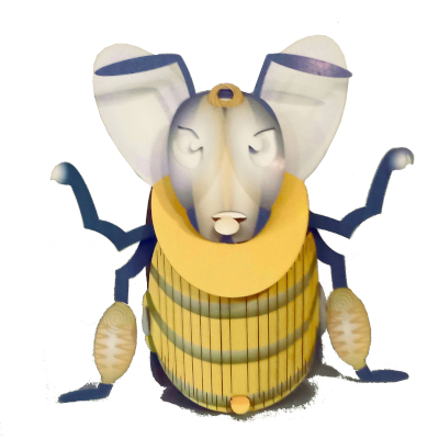
The bee

This is a title I found in their blog – cutpopup.com
For a long time; I wished to have social media BIG disapproval button.
It is the first thought I have looking at their page.
Their “About” and “Contacts” info pages reveal the Great pretenders quickly behind.
Pretenders, because claiming that their work is the work of numerous designers, there are no names in sight, and quite monolithic design sets do not show individuality. Plus, 3 locations on three continents leave no doubt.
Big (Chinese) Money trying to cash out on a trend.
I was looking at their designs.
The overwhelming feeling I have looking at is sadness. Somehow in my mind, I see an image of countless Estate sales in the US populated by always the same unimpressive merchandise. Among them, these Popup cards that supposed to be cute, but where even the passing time did not reveal the familiar atmosphere of past time. Infinite sadness of lives that passed dressed in mass-produced things pretending to be highlights of their lives. There is nothing special. Not even the tiniest treasures bring joy to your heart. Instead, there is the grey feeling of a desert. Run-of-the-mill merchandise.
The biggest surprise awaits you when you check their blog and comments.
Of course, I am biased, expecting some extra effort from the designer, not this picture of neglect.
Checking their post:
“What is a popup card? All you need to know.”
In recent comments:
Clicking on one of them (Alanya Escort Bayan”)reveals some pornographic pictures of young women exposing themselves, advertising escort services in Turkey.
Another one leads to a website (In the Polish Language) with some statistical information about the United States.
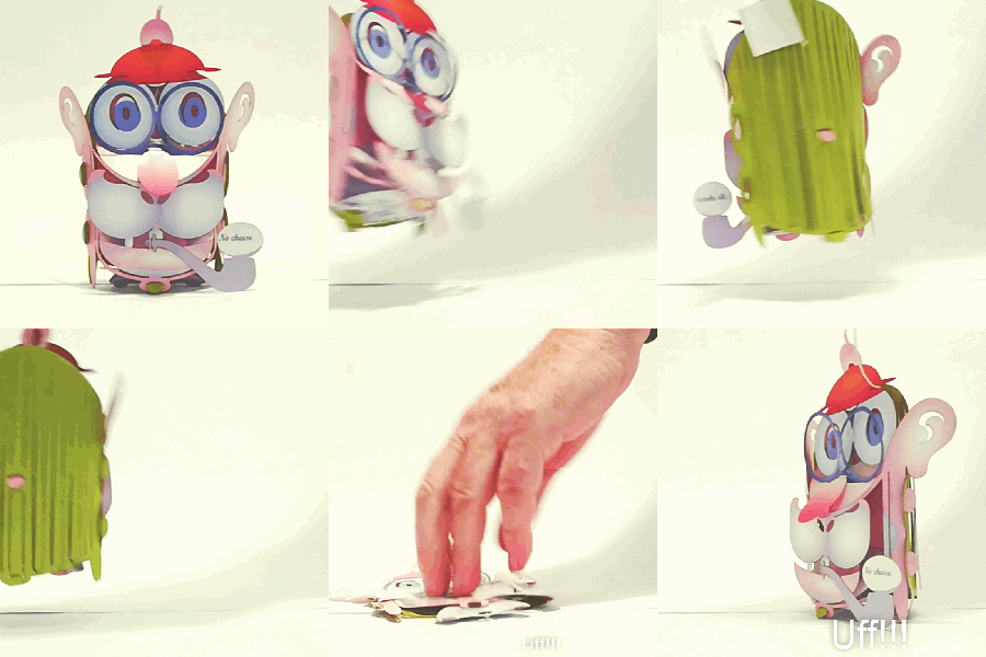
The third one I checked with the enticing subtitle “effects of marihuana use on ZEBRA pop-up cards” leads you to a page with a surprise: ZEBRA.
Nobody cares. Nobody checks the comments.
The reviews you can find there….. each contains their advertisement.
The image here has a link to their website. cutpopup.com
Checking their return and refund policy brings up another surprise (or maybe not a surprise). I saw it already a couple of times with Chinese sellers on Amazon or elsewhere. There is a restocking fee of $10. So the postage cost plus the $10 “restocking Fee” makes you richer with one more experience. The return cost of the $12.50 item is more than the purchase cost, and since nobody checks such details the seller made sure that there are no returns ever.
My Advice? Stay away. there are enough nicer cards you can find elsewhere without the additional entertainment of dealing with their “Return or other Policies.”
Posted on

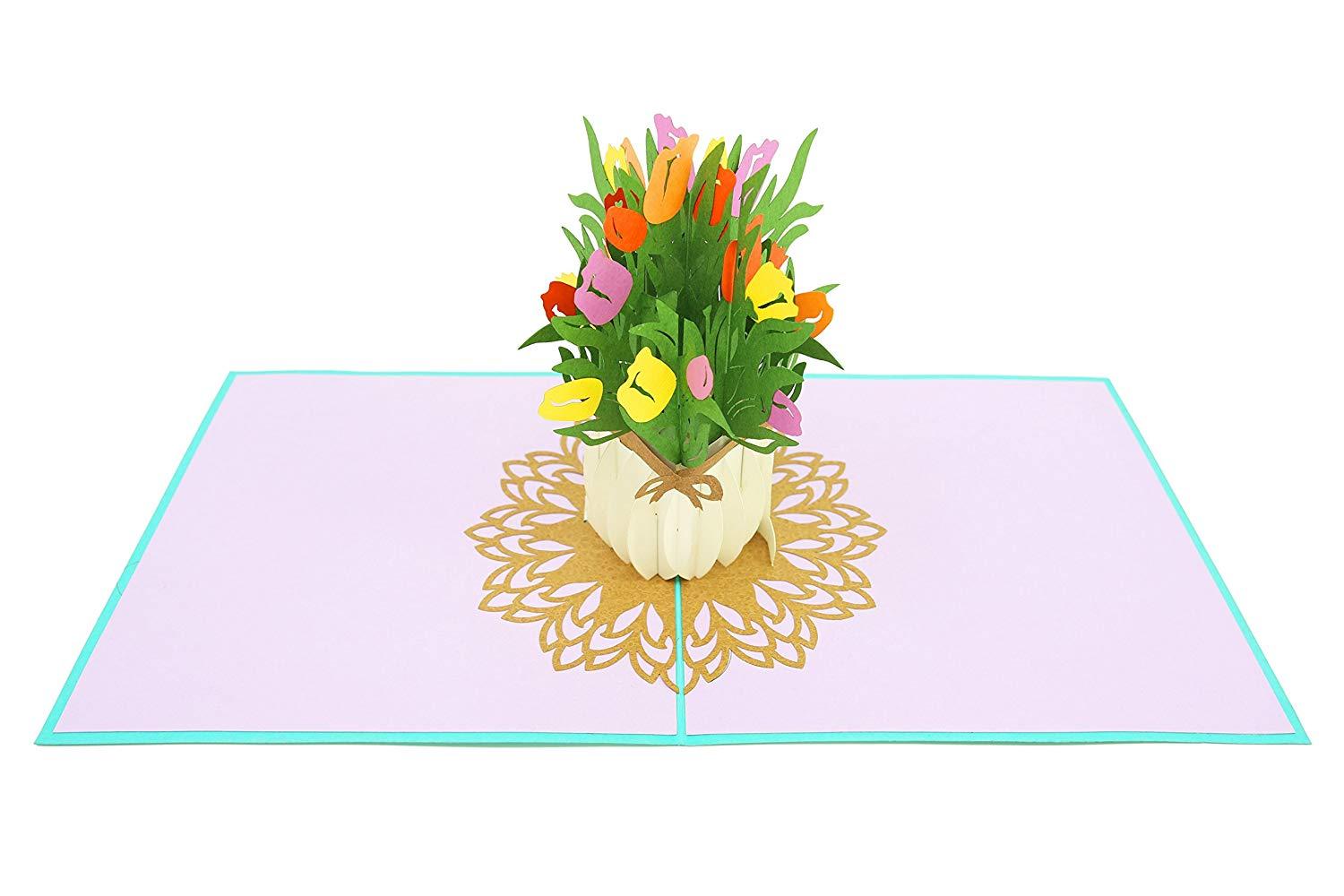
poplifecards.com or not every pop-up card is cute.

A new website carrying pop-ups is showing on the horizon. After the quick inspection is clear to the viewer that there is no slightest effort to distinguish themselves from the competition. there is NO invention, No dedicated designer behind. Just repetition of medium quality designs so well known from offerings by other sellers. There is no way to distinguish their cards from any other Vietnam (Or China) importer. The generic website offers no info about the people behind it, but after a closer inspection is clear that this is the website of one of the Vietnam-based makers as it points to their pricing policy and the number of rather unimpressive designs. However, there is some extra effort since the manufacturer offers printed cards instead of single-color colored papers used by others. As a result, some of the cards are a little bit neater than the competition.

Posted on

Fresh Cut Paper? popup cards with no so fresh interpretation

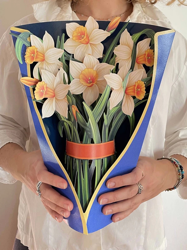
FreshCut Paper Dear Dahlia comes with its very own festive pink vase that allows it to sit on any flat surface. Our paper flower bouquets never wilt, never fade and never lose thier color. More than a greeting card, it's a keepsake for years to come for any recipient. There is a new website on the paper horizon. “FreshcutPaper”
On the first sigh, impressive, nice graphics and designs.
But after 3 seconds, there is also a reflection.
Looking at the subject of the designs, the viewer starts thinking.
I saw it already somewhere.
Of course, it’s the new trend of paper flowers we call among us the “Mee too movement.”
It has nothing to do with the well-known social movement against sexual abuse and sexual harassment.
It is about designers impressed by others who start the same subject.
This time I dare say they follow our Paperbee.net pop-up flowers.
ME too, I too, screams their web pages suddenly featuring a bunch of paper flowers.
I like the subject, and I can do it too.- screams the page.
Can you?
1) The designs are SO BIG. At least 24″(60cm) high. The size alone physically prevents any attempts to have them on display Longer. Small is beautiful. Not BIG.
Who is going to keep it on display, requiring so much space?
There is no certain intimacy we develop with small and beautiful.
2) Stylized Designs are well done, but… It is quite clear that the artist cannot bring his own interpretation of the subject, and that’s why he sticks to realistic renderings.
Lack of creativity and, in my opinion, understanding of the medium shows up when we look at the string of the designs. He is changing flowers but they look all the same. BORING in effect.
God-given spark is not present.

On the positive side. I can congratulate the designer that he is trying to bring his own voice to the growing paper flowers Field.

With so many web site pushing China/Vietnam-made and design pop-ups, his work is a welcomed addition.
Frankly, I am afraid after the initial push; he may not last very long. Small sizes and an interesting variety of interpretations are needed.

The cultural background (US raised) emphasizing repetition (not developing interesting variety) works against the designer. Of course, looking at his website, he totally disagrees with our assessment.

The image has the link to their website.

Posted on

uwpluxe.com – O, such painfull name

Do you know them? Interesting! But not quite Original pop-up cards.
The cryptic name “uwpluxe.com” ensures that you are going to forget it quickly.
Straightforward construction. It catches my attention for two reasons.
1) They supply a nice selection of pop-up cards to MOMA NY “Museum of Modern Art.”
2) Simplicity of the construction of the cards on the border of boredom.

No, they are quite nice but seeing the selection of available cards, I put them above the Chinese/Vietnam-designed cards (Too ornamental) and below the British ones.
What attracts my attention is that one of the designs mimics one of my first ever designs (Green wardrobe). Of course, this is their own (White Color) interpretation, but I think the designer may have difficulty coming out with their own new subject.

Surprisingly I see one of their best designs in the “sale” section of their website. “Dream Big” card.

I think this “Southwest Skull” subject may play well in the EU but not in the United States of America where people subconsciously avoid subjects referring to the painful areas of American Lives and the feeling of guilt.
The world “stockists” used on their site suggests that the owner of the web site is from the other shores, a lucky escapee from the abyss of Brexit
So we wish them good luck but, overall we are not impressed.

Posted on

The quality of your Greeting card goes long way

The Face By Jacek Alfac.us

Have you ever thought about how your greeting card is received?
Is it quickly put away?
You bought run-of-the-mill cards and they are recognized as such by recipients?
Lost opportunity since a better, memorable piece of paper art may keep your name longer on display and bring you either some love or some new business.
It will not cost you a dime more, just some attention to where to spend your hard-earned money and get a better product. There are some significant differences in how cards are received.
3-dimensional cards stay on display While flat greeting cards?
Usually, they disappear quite quickly. Some remain on display for a few days. Especially during the holiday season. After that? Most of us discover flat cards during big cleaning projects; years later tucked away.
3D pop-up cards hold more staying power with some differences.
1) The one in the “book” form requires two hands to open and face a similar fate. They are exposed to the viewer just for the moment. Not a big difference compared with the flat one.
All of them are Almost or let’s say simply IDENTICAL.

Sold, for example, by Lovepop, Hallmark, Americangreetings, Chinese companies on E-bay, and a number of other sellers under different names.
2) and then really original Free-standing cards remaining open on their own, at the TOP of the Pack.
Like Santoro, Paper D’Art, Graphics3inc, or us, Paperbee.net


They stay displayed by the recipients for DAYS., and months to come.
Take it into account when you decide which of the little ambassadors you will employ.

The quality of your card goes long way.

Posted on 1 Comment

Paper Bee Pop-up mania

bee popup card


Have you noticed people’s unusual fascination with pop-ups? Grown men and women long past their teenage years are attracted to small paper buildups opening another world up the front of their eyes.
I think their attraction to such toys shows that everybody caresses a playful Child inside regardless of age. Our normally shown outside is Knight’s armor to defend ourselves from intolerant people without imagination and low self-esteem. This playfulness makes unbearable days easier and brings unquestionable benefits because people with smiles live longer, healthier, and happier lives. So Do not limit your happiness regardless of how silly the reason may appear to others.

Because of the health benefits a smile brings shouldn’t I consider myself a Healthcare provider? And charge people accordingly. I mean out of the blue and sky-high. If U.S. Congress a few years ago recognized pizza as a vegetable… in our country anything is possible.

Posted on

Santoro – British pop-up cards.

santoro card

Santoro is one of the most innovative publishers of pop-up greeting cards. Engineered, designed, and printed in the UK.

First, they searched for their soul, trying a few different design types before settling on a few proven ones.
Since they ventured outside of the pop-cards realm, I would not expect major changes in their offer.
Their energy is now applied in other directions. (Among other Real estate development)
But their selection is first class.
One of my observations is that their cards are divided into two parts.
!) Self-assembly (by the recipient – of course)
2) More complicated and elaborate Buildups.
All of them containing something movable, free-hanging elements.
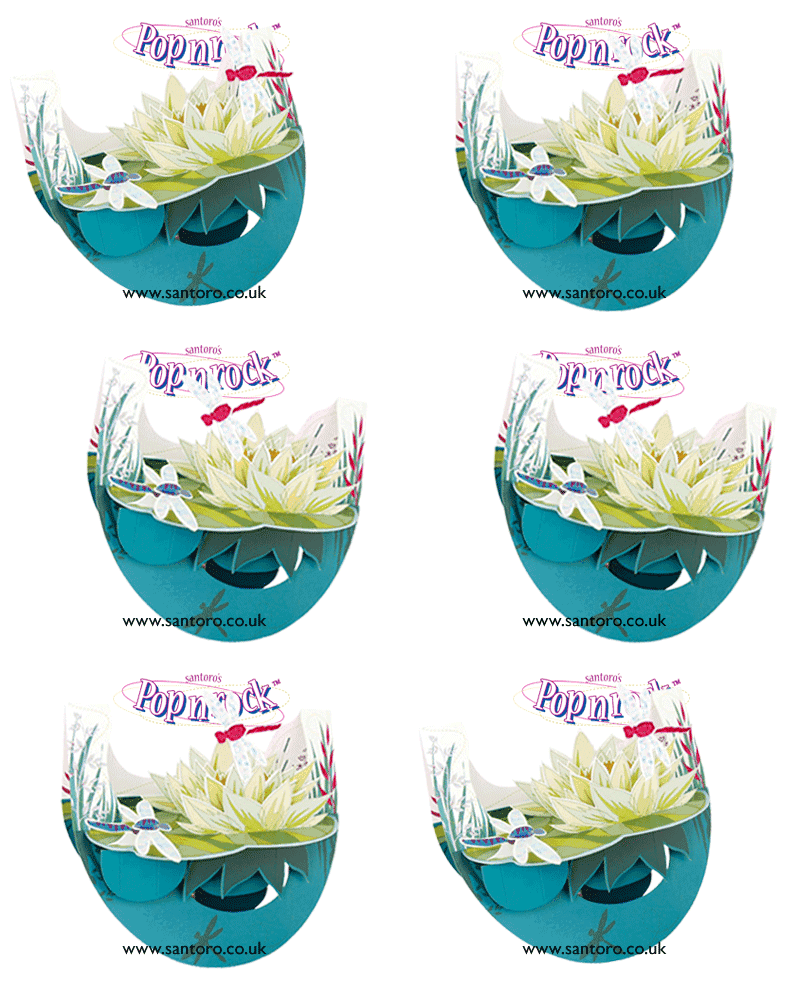
I am a big fan of their (simple) “Swing Cards,” but when it comes to their “Pirouettes” and “Poprocks” and “Pendulum” cards, I think that they may be too complicated and too big to enjoy on everyday displays of their recipients. I think small is more beautiful than BIG. More intimate and better equipped to reach the hearts. But their popularity is telling me that I am wrong. One of the lessons I learned in the past is: do not underestimate your lesser achievements because they may be the top ones in public eyes. I still remember Chicago Art Institute Buyer, who chose, to my surprise, not the best-designed Glass Flowers, when to enlarge my offering. I included some (In my eyes) lesser designs in a bunch of my samples they requested.
Going back to the Santoro. They are an excellent destination for your gift offerings.

Posted on

Up with Paper. Pop-up simplicity.

When I first saw “Up with Paper” greeting cards I was impressed with their small square cards. Their traditional book format was something new in the right size, and they were a success story with virtually no competition. Graphic3D existed much longer but was and still is invisible, focusing on a steady business market. Far away from the hustle and bustle of retail. I think “Up with Paper” initial success was not justified for a period of time because their made in China cards did not stand out exactly with their quality. Their rough-cut pieces glued together did not make an impression when inspected close up. It changed, and now you can enjoy well made and designed cards with nice simple artwork. I do not see any new concepts, but as with every established business, they focus on their proved holdings. A nice choice for occasional mailings to your friends and family. They also try their hands on a small collection of pop-up books. I am less impressed with it, but they addressed it to kids, and apparently, some kids enjoy their work.

Posted on 2 Comments

Smart paper cuts. Florida

A Christmas Tale
A Christmas Tale pop-up book by Vojtech Kubasta

When my wife and kid enjoyed the warm beaches during our annual Florida vacation, an active person like me scouting for unusual and beautiful, found in the local museum collection of pop-up books by Vojtěch Kubašta. Paper “Umelec”(Artist In the Czech language) put the old-world’s overwhelming charm into the pop-up world. In Florida, unexpectedly, I was back in Prague still remembering the charm of the Old City, The antiquariat where I was buying the 19 century, old human anatomy books with wonderfully illustrated pop-up cut out of organs you can move to see the next layer of the human body. The “Wlasky salad” and “housky” buns I was buying in the neighborhood store every morning.

Vojtech Kubasta was able to transfer the charm of the old-world into the pages of his books. For me, it was a sudden transfer into the charming and long-forgotten world.

The language I was able to master enough to start reading books in Czech quickly. Places where everybody wishes you a Good day regardless if you know anybody there. The strange way the coffee is served and people keep utensils when they are eating. During the fall, the dark sweet cherries I was eating sitting among the branches of huge cheery tries in an old palace park—the dark memory of the day I had to leave this newly discovered and charming world behind. After so many years, it still hurts.

Hej, Wake up. I have heard the voice of my wife. The curator of the Fort Lauderdale museum asked about the Vojtech Kucasta books’ collection agreed to show to us, my family, the treasures in his possession. I wish you the same experience.

But please do not go to Prague for the Beer drinking trip. Lucky I was able to enjoy the old city before the era of tourist invasion. There still were old antique cars on the streets, dark cities after sunset, and beer number 10 showing without question automatically up the front of every new guest in the local “Wycep” (Pub)

Posted on

Smart paper cuts. The pop-up cards among us.

It seems, during the last few years, everybody gets infected with the idea of pop-up greeting cards. Several companies started chinese dragon popupproducing (in China & Vietnam) a bunch of pop-ups. Unfortunately, it is virtually impossible to distinguish one “original” design from another offered by the competition. The reason is that labor, especially labor of skilled and able to produce original artwork paper engineer is time-consuming and quite expensive, and there are so few really creative people around. It Is easier to grab already made Chinese designs. In effect, most offered pop-ups are generic, and in my humble opinion simply “Boring.” Looking at the flurry of colors and forms first is hard to catch the obvious, but after a while, it becomes apparent stopping us in our quest to find something unique for our valentines.  The flood of mass-produced pop-ups is especially visible when we search for pop-up cards on the internet. There is the sea of Chinese-style trees, and over-sweetened and drowning in ornaments paper flowers, castles, hearts, motorcycles, paper steam locomotives, and Chinese dragons. Ourselves we received an email (through our Etsy shop) from a Vietnamese company offering its services but having the desire to offer only unique and beautiful of course we declined.  If you follow me, In the next few posts, I will show you the true gems of the paper word invisible in the flood of the run of the mill.


Posted on

My favorite maker of Popup Cards

Are you looking for a neat gift to send to your friends? A company in Great Britain, “SANTORO” developed some quite nice 3-dimensional sculptures made, of course, from Paper. “Swing cards,” “Baubles,” “Piroquettes,” etc. What unusual is the number of new challenging types of construction they attempt to offer to their clients, A gift and card in one? You may be sure that your pop-up gift is not going bo tossed away right after Christmas time. Even better, they may survive the carnage of the coming months and show as decorations on your friend’s Christmas Tree next year.