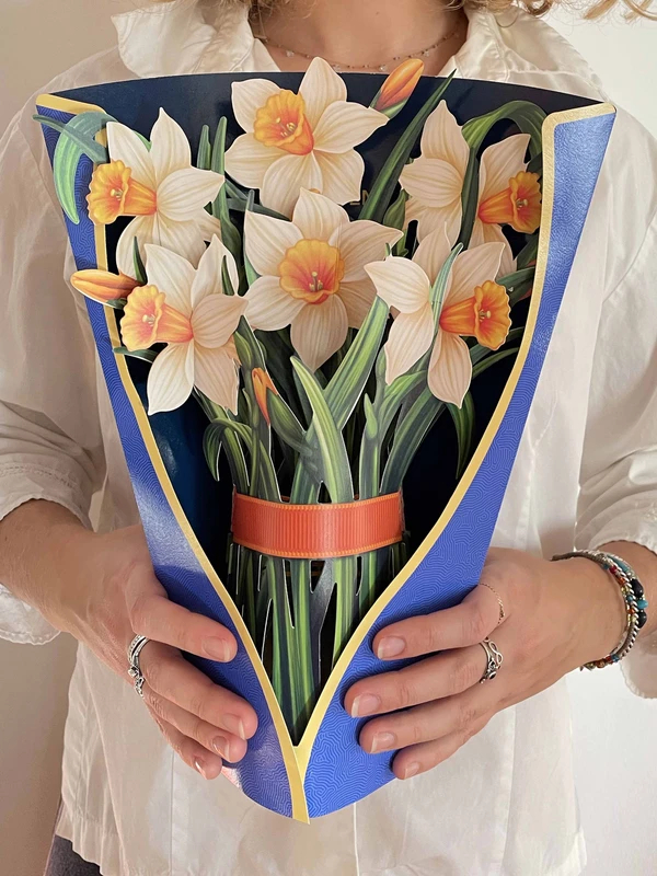
 There is a new website on the paper horizon. “FreshcutPaper”
On the first sigh, impressive, nice graphics and designs.
But after 3 seconds, there is also a reflection.
Looking at the subject of the designs, the viewer starts thinking.
I saw it already somewhere.
Of course, it’s the new trend of paper flowers we call among us the “Mee too movement.”
It has nothing to do with the well-known social movement against sexual abuse and sexual harassment.
It is about designers impressed by others who start the same subject.
This time I dare say they follow our Paperbee.net pop-up flowers.
ME too, I too, screams their web pages suddenly featuring a bunch of paper flowers.
I like the subject, and I can do it too.- screams the page.
Can you?
1) The designs are SO BIG. At least 24″(60cm) high. The size alone physically prevents any attempts to have them on display Longer. Small is beautiful. Not BIG.
Who is going to keep it on display, requiring so much space?
There is no certain intimacy we develop with small and beautiful.
2) Stylized Designs are well done, but… It is quite clear that the artist cannot bring his own interpretation of the subject, and that’s why he sticks to realistic renderings.
Lack of creativity and, in my opinion, understanding of the medium shows up when we look at the string of the designs. He is changing flowers but they look all the same. BORING in effect.
God-given spark is not present.
On the positive side. I can congratulate the designer that he is trying to bring his own voice to the growing paper flowers Field.
With so many web site pushing China/Vietnam-made and design pop-ups, his work is a welcomed addition.
Frankly, I am afraid after the initial push; he may not last very long. Small sizes and an interesting variety of interpretations are needed.
The cultural background (US raised) emphasizing repetition (not developing interesting variety) works against the designer. Of course, looking at his website, he totally disagrees with our assessment.
 The image has the link to their website.
Discover more from Smart Paper Cuts
Subscribe to get the latest posts sent to your email.


